Here is a brief summary of the workshops:
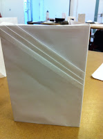
COMPOSITION - Paul talked to us about the book cover that we have to design which will also fold out to be an A3 poster. How to arrange the poster to communicate what is in the book and create interest & intrigue. We tried to do some folding and cut and paste techniques to get us started thinking about the cover, here are some examples:
REPETITION - Katy talked to us about repetition and how it can be used to create meaning, as a tool to emphasize a point and how our minds learn through repetition. She sent us out to find patterns and repetition and to draw or photograph what we find. Here are a few of my photo's:
Silhouette - Darren taught us about using silhouettes to create images and we did our own in class. I really liked this instat way of working and was an easy way of creating imagery. Here's what I made:
MOVEMENT - Karl talked to us about documenting a chain of events, such as a journey and how we could utilise transition techniques such as those in Scott McClouds book 'Understanding Comics'
MONOPRINTING - Rachel taught us monoprinting which is a very basic and easy technique.
LAYERS - Darren taught us how to create simple layered images using bitmapping and duotone to make them more interesting. We also had to design a book cover using this technique. Here's some I made:
EMPHASIS - Jo taught us about emphasis in typography and using different typefaces and sizes.
SCALE - For Rachel we had to produce a boardgame using a big subject and editing it into a boardgame, I made a game based on the food in the cafeteria at college.
RULES: The Architecture of Lines. - Karl talked us through the geometry of lines and representation in 3D, our brief was to create a model of a new landmark for London, ours was a 3 sided structure that can be seen from afar that shows the temperature and also is a place to visit with gardens on different levels:
UNITY - For Darren's workshop we had to bring in images of two contrasting high Streets, one in posh area and one in a poorer areas and look at the differences and trends in colours and design in each area
REDUCTION - With Jo we created maps of london using only type and colour and no lines, here is the map that we produced
SYMBOLISM - Paul talked to us about Symbolism and using pictograms as representation, we created our own pictograms about an aspect of London. Mine was about market stalls with the bowls of fruit for a pound, something I've never seen anywhere else.
TIME - Darrens class was about representing the passing of time. We watched a lot of clips from the film Koyaanisqatsi, which is an amazing film, here is a clip:
Phew, I think that's all of them covered.


No comments:
Post a Comment